
So, the challenge here wasn't refining the visual identity; it was in identifying how to design a balanced digital experience with the brand's desired positioning and present information with clarity and structure, to invoke trust in clients while supporting business growth.
When I entered the picture, Bigul had already established its brand identity and industry positioning to be vibrant and playful. The in-house team had created an informational website as a pitch of their new business, but the site wasn't helping the cause, that is, to convert browsers into their clients.
Challenge
Standing out without being taken lightly
old home page section that looked friendly and nice but failed to convert clients


However, being different alone wasn’t getting them clients. They needed to provide clear information as well, which their current site structure and layout didn’t support.
Before redesigning anything, I stepped back to understand what Bigul was already doing well. The brand wasn’t trying to look like another serious trading platform. It had leaned into vibrant colours, playful illustrations, and friendly language, with a desire to make trading and investing feel more open and modern.
Research
Making sense before screens
The task was to transform Bigul’s intent into a clear, engaging and scalable digital experience.


So, I approached them as a single system rather than isolated pages. I designed a shared layout and content structure to create familiarity and flow, while allowing creative elements to adapt to each segment’s content.
The redesign began with the brand shifting its focus from features to users. Their internal research had identified three core client segments – Traders, Investors and Developers – each with distinct motivations and needs, and a corresponding set of services curated for them. Now the need was a way to present these offerings with consistency and clarity.
Approach
Designing for clients


This helped users intuitively understand that these were parallel choices, three paths at the same level, rather than disconnected offerings.
And, to stay true to the brand’s personality, I retained the existing illustration style but tailored it to each piece of content and ensured that it aided in making the content scannable, understandable and engaging.


The next focus was designing for the wealth of information Bigul needed to present. Their offerings spanned tools, products, and live market data, all of which were expected to change and grow constantly. Instead of designing each page individually, I worked on defining repeatable page structures that could adapt to real content while maintaining brand personality, clarity and ease of use.
Structuring
Designing For Information
(info sites can have PDPs too!)
A reusable structure designed to introduce their products clearly while supporting feature additions and variations for different product pages.
Like, this Product Description Page


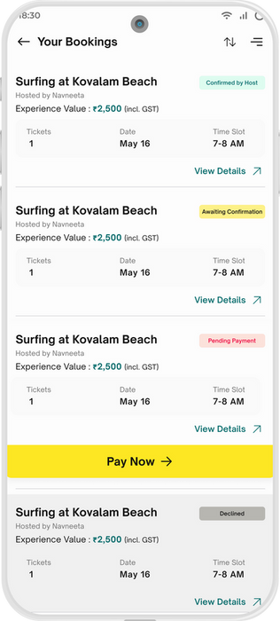
To support the brand’s new offerings, curated experiences, I designed an elegant feature flow: easy and exciting discovery, detailed exploration, and an intuitive booking path. Each step was crafted to maintain emotional engagement without sacrificing clarity.
02
Browsing & Booking Travel Experiences


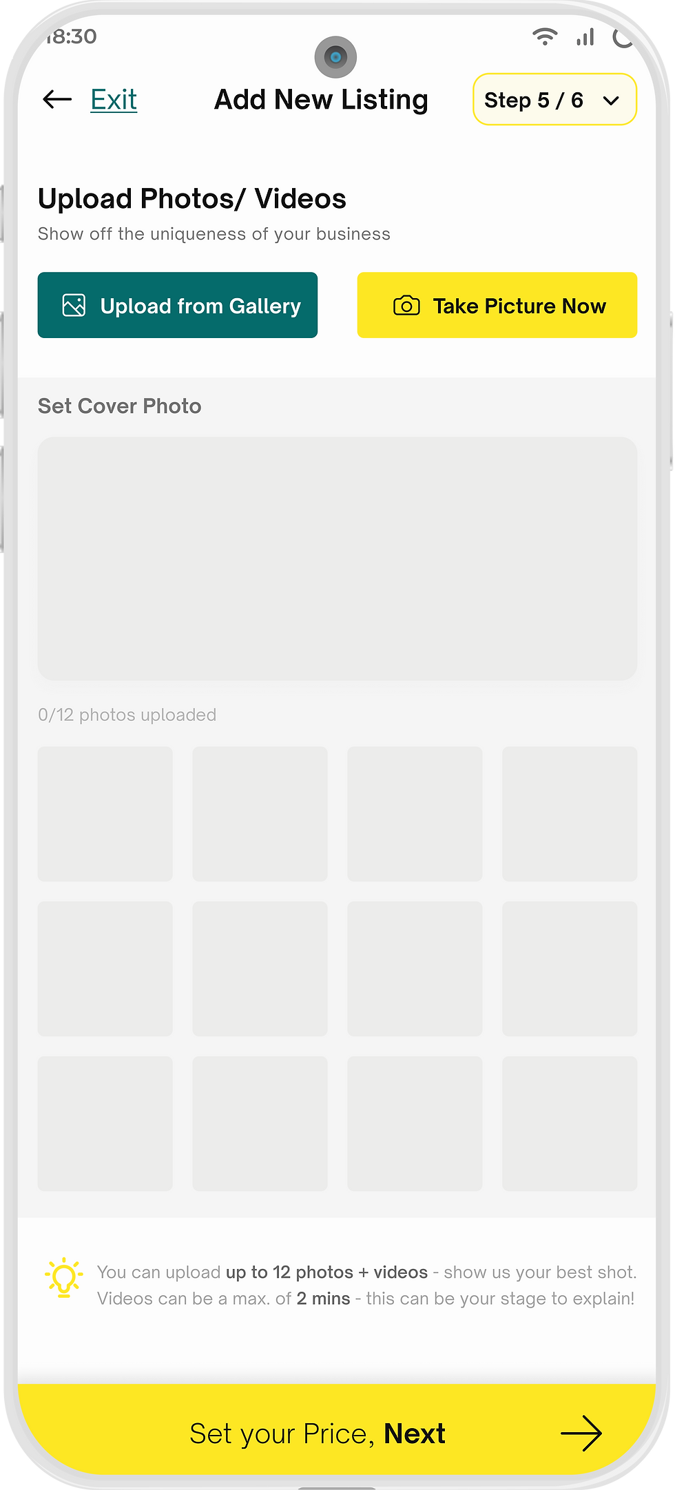
Behind every curated experience lies the Service Partner, the unseen guide. Their interface, once tangled in forms and friction, was redesigned into a guided, purposeful flow. Each step now felt clear, considered, and on-brand, helping partners list services with confidence.
03
The Other Side of a journey

From dreams to departures, everything feels part of one coherent story.


The next focus was designing for the wealth of information Bigul needed to present. Their offerings spanned tools, products, and live market data, all of which were expected to change and grow constantly. Instead of designing each page individually, I worked on defining repeatable page structures that could adapt to real content while maintaining brand personality, clarity and ease of use.
Structuring
Designing For Information

A friendly nudge for travellers who paused their booking halfway
1
Empty state that didn't just inform but also encouraged next action
2
A progress prompt in the profile screen as a subtle motivation
3
While the core flows defined the experience, it was the smaller moments that made the app memorable. We zoomed into every interaction so each moment would reflect Travel Buddy’s optimistic, approachable tone because design isn’t only about what users do, but how they feel while doing it.
04
Deal is in the Details
Closing the Loop

The redesign soon extended beyond mobile as we began shaping how Travel Buddy could adapt as a web app by mataining its essence while gracefully expanding its reach.
With design and development moving in tandem, collaboration became effortless. The whole team shared the same design space (on Figma Software) with me, allowing ideas to evolve transparently and decisions to stay collective.


While redesigning the entire app for Travel Buddy, I was reminded of an essential principle, BALANCE. I relearned the importance of knowing when to redesign, when to refine, where to follow the trend, and where to stay grounded in time-tested principles. The process taught me that clarity often emerges not from adding more, but from simplifying with intention.
Learning
This project taught me...


