top of page


Travel Buddy, an emerging Indian travel-tech startup, had outgrown its interface. The brand had evolved, but its product hadn’t kept pace.
My role was to realign design with ambition, to craft a digital experience that felt as intuitive and inspired as the journeys it aimed to enable.
Client: Travel Buddy • Project: App Redesign
Skills: UI/UX Design, Product Strategy
Role: Product Designer
Redesigning the digital interface and experience for Travel Buddy

• The app’s interface and brand identity felt disconnected.
• Navigation across services was inconsistent and confusing.
• New features lacked a clear hierarchy and integration within the main flow.
Key Observations
As the brand expanded, its design struggled to keep up. The visual language no longer reflected its energy, and users found navigation increasingly fragmented. The challenge lay not in starting over, but in refining the structure and rebuilding a product that could grow gracefully.
Challenge
Finding clarity in a growing product
A need for a product that not only functioned better but felt more cohesive, where discovery, planning, and booking could unfold naturally, as one connected journey.
What emerged...
To redesign with purpose, I began by listening to both the brand and its users. Stakeholder interviews revealed strategic ambitions, while usability reviews and public feedback exposed gaps in clarity and usability.
Research
Understanding before designing
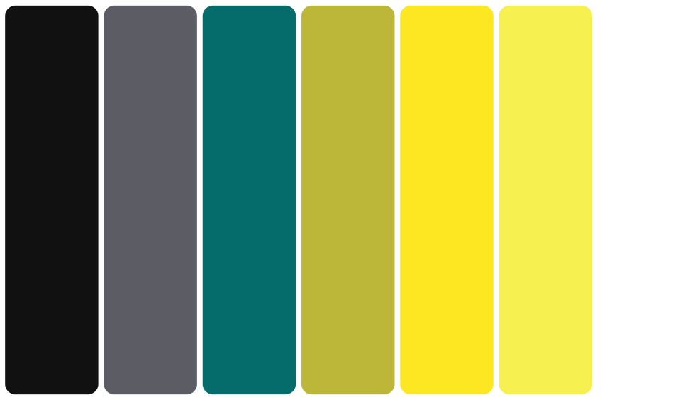

So I began by enriching the colour palette to introduce energy and vibrancy, a visual cue for optimism and exploration. Then shifted the typeface to one that felt more human and open, improving both the tone and readability. With this, the Logo also needed refinement, not just its colours but also the core idea it represented. So, I fine-tuned it to better reflect the brand’s USP, connection and companionship.
The redesign began with the brand itself. Travel Buddy had outgrown its visual language, though its story remained compelling. My goal was to preserve that spirit, not to reinvent.
Approach
Refining the Brand
The result was a refreshed identity that remained familiar yet more confident and contemporary, a foundation ready to support the redesign that followed.

From dreams to departures, everything feels part of one coherent story.


The redesigned app now functions as a fluid ecosystem with every feature intuitively placed, every journey thoughtfully connected. Users can explore, plan, and book without friction or cognitive load.
01
Cohesive Navigation


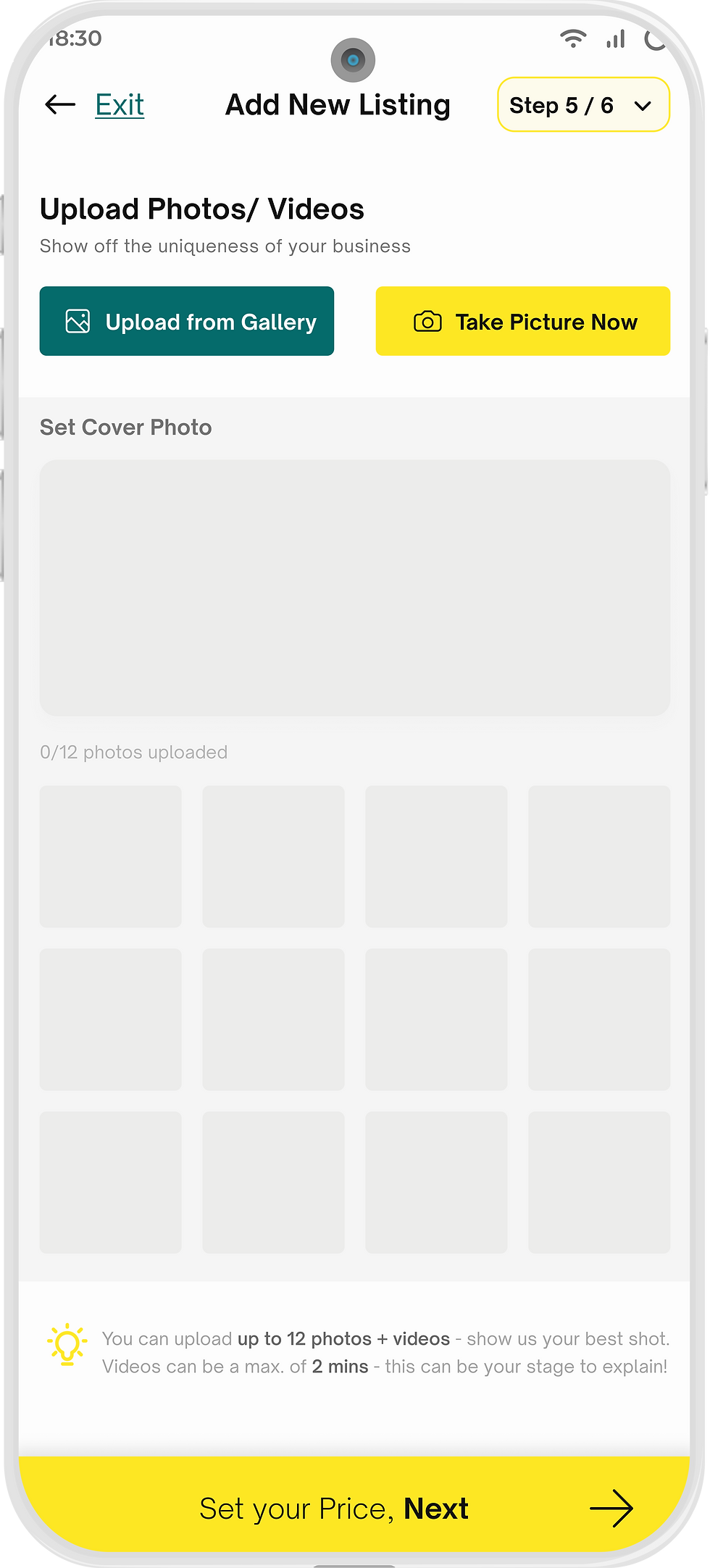
To support the brand’s new offerings, curated experiences, I designed an elegant feature flow: easy and exciting discovery, detailed exploration, and an intuitive booking path. Each step was crafted to maintain emotional engagement without sacrificing clarity.
02
Browsing & Booking Travel Experiences


Behind every curated experience lies the Service Partner, the unseen guide. Their interface, once tangled in forms and friction, was redesigned into a guided, purposeful flow. Each step now felt clear, considered, and on-brand, helping partners list services with confidence.
03
The Other Side of a journey
A friendly nudge for travellers who paused their booking halfway
1
Empty state that didn't just inform but also encouraged next action
2
A progress prompt in the profile screen as a subtle motivation
3


While the core flows defined the experience, it was the smaller moments that made the app memorable. We zoomed into every interaction so each moment would reflect Travel Buddy’s optimistic, approachable tone because design isn’t only about what users do, but how they feel while doing it.
04
Deal is in the Details
Closing the Loop
The redesign soon extended beyond mobile as we began shaping how Travel Buddy could adapt as a web app by mataining its essence while gracefully expanding its reach.
With design and development moving in tandem, collaboration became effortless. The whole team shared the same design space (on Figma Software) with me, allowing ideas to evolve transparently and decisions to stay collective.

While redesigning the entire app for Travel Buddy, I was reminded of an essential principle, BALANCE. I relearned the importance of knowing when to redesign, when to refine, where to follow the trend, and where to stay grounded in time-tested principles. The process taught me that clarity often emerges not from adding more, but from simplifying with intention.
Learning
This project taught me...


bottom of page