
CLIENT - Travel Buddy
CASE TYPE - Product Redesign
SKILL USED - UI/UX Design, Product Strategy, Brand Design
HIRED AS - Independent Product Designer [and Detective ;)]
TRAVEL APP
WANDERING
THE CASE OF THE


The Mystery was not merely aesthetic. It was a question of identity, direction, and clarity.
Though their name and new insignia spoke of evolution, the product itself remained in a previous chapter. The design did not echo the ambition of the enterprise.
Travel Buddy, a rising Indian travel-tech brand had outgrown its shell.
What appears, at first glance, to be mere disarray often conceals the roots of something far more intricate.

MYSTERY
THE
IDENTIFYING THE PROBLEM
-
The brand's voice and visual identity were misaligned with their new vision.
-
Users struggled to find services and navigate key offerings.
-
The app's structure felt fragmented, especially with new features.
What the evidence revealed:
Before any solution could be drawn, the groundwork had to be thorough. The inquiry commenced with methodical stakeholder interviews, an audit of public forums, and a deep dissection of the app’s current state — all in pursuit of buried clues.
It is a capital mistake to theorise before one has data. Insensibly, one begins to twist facts to suit theories, instead of theories to suit facts.
THE SCENE
FROM
CLUES
BEGINNING THE RESEARCH
The result? A product that didn’t just work—but spoke!
The app’s foundation was reorganised to house new features with grace. Each interaction was considered, ensuring the traveller’s journey felt as coherent as the adventures they sought.
Along with a welcoming font, the tone was altered to match the brand’s newfound persona—approachable, energetic, and confident.
The course of action was twofold:
To reconstruct a narrative, one must first untangle the noise.
SOLViNG
METHOD OF

APPROACH TO SOLUTION


No more platform-hopping. No more fractured planning. From dreams to departures — all under one digital roof.
Sections were no longer scattered scenes from a travel diary — they became chapters in a seamless narrative. The result was a single destination where every leg of the user’s journey was accounted for.
With the new brand vision firmly established, my next step was the orchestration of the platform’s core anatomy — the app's flow, its organisation, its purpose.
It has long been an axiom of mine that the little things are infinitely the most important.
TRAVEL
REiNVENTiNG
OVERALL REDESIGN


-
First, discovery — ensuring users could browse experiences as effortlessly as one flips through well-kept case notes.
-
Then came the details — rich content, visual clarity, and the ability to compare and consider.
-
Finally, resolution — a streamlined booking journey designed to be intuitive and exciting.
A fine idea, but the existing app was not equipped for the task. I approached the matter methodically...
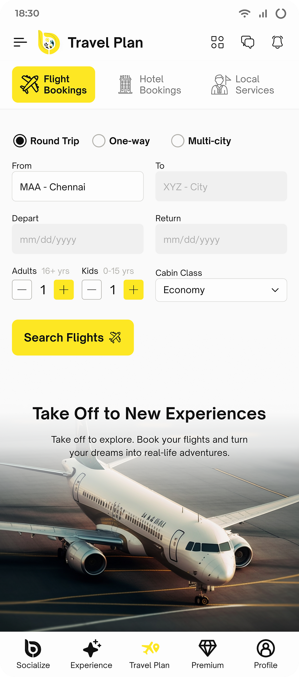
The client had introduced a new ambition — a catalogue of curated travel experiences.
From the spark of wanderlust to a confirmed itinerary, every screen became a stepping stone — deliberate, logical, and above all, human.
EXPERiENCES
TRAVEL
EXHiBiT (A)
NEW FEATURE FLOW

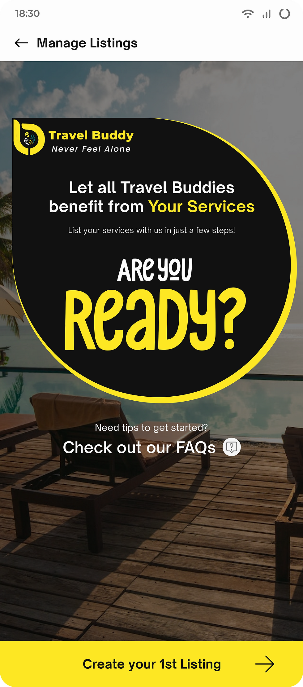


The partner could now list services step-by-step, with purpose and poise, understanding how each detail would entice a future customer.
-
I began with the traveller's lens, ensuring exploration and booking were intuitive. Then, turned the magnifying glass upon the overlooked partner, whose interface was, until now, a grim bureaucratic affair. A tedious form.
-
So we reframed the experience — not as a form to be endured, but as a narrative to be authored.
Travel Buddy served two distinct personas — the Traveller, ever in search of their next story, and the Service Partner, the orchestrator of that journey. Both vital. Both deserving of clarity.
Two identities.
Two experiences.
One coherent platform.
DUAL USER PERSONAS
EXHiBiT (B)
FEATURE FLOW UPGRADE
Below lies the visual trail — a curated series of all the redesigned screens that bring the investigation to life. Together, they reveal a platform transformed: functional, fluid, and finally, faithful to its purpose.
Data is, after all, only as valuable as the conclusions it inspires.
UPDATED APP FLOW


-
Integration of real-time flight search results.
-
A smart itinerary planner adaptable to live changes in travel.
-
A dedicated feedback and bug-reporting mechanism.
-
Plans for usability testing to align evolving features with real user behaviours.
This case reminded me: good design isn’t about feature-stuffing — it’s about thoughtfully resolving tension between what users need and what businesses envision. Travel Buddy was not merely a design project. It was a case of clarity, empathy, and systematic reinvention. And when the clues are read correctly, the solution, like always, becomes elementary.
Before handing off the redesigned product to the development team, I marked a few future enhancements — ensuring the case could evolve with time:
The groundwork was laid. Now, it was up to the builders to bring it to life.
REFLECTiONS...
THE FINAL CHAPTER
OR